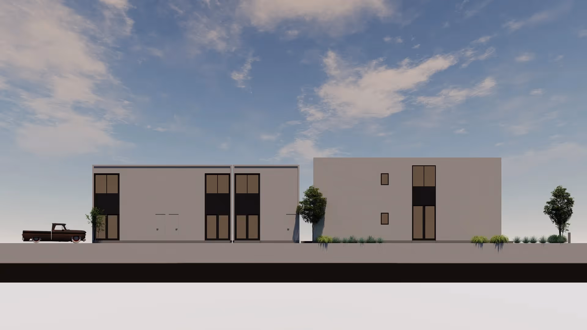
Ten Seventy Architecture encourages a Total Design process -complete design from the logo to the architecture in a unified concept or brand. Branding is important to the way your business is perceived.
We wanted to refocus our marketing effort on high design projects + a sleek, hip clientele. Our previous logo was bold / bubbly which didn’t speak to the modern / minimalist ideals of Ten Seventy Architecture. As modernists we naturally choose the most functional font; Arial (it’s available everywhere).

Our previous logo was sometimes mistakenly pronounced ‘Ten-Ten Architecture’ so this was our opportunity to change that. By pulling in the leg of the 7 we were able to differentiate it from a 1. We utilized the golden ratio proportions to represent our commitment to great design.

A bold + simple set of words that the market know what type of architecture firm we are + what type of projects we’re best at.

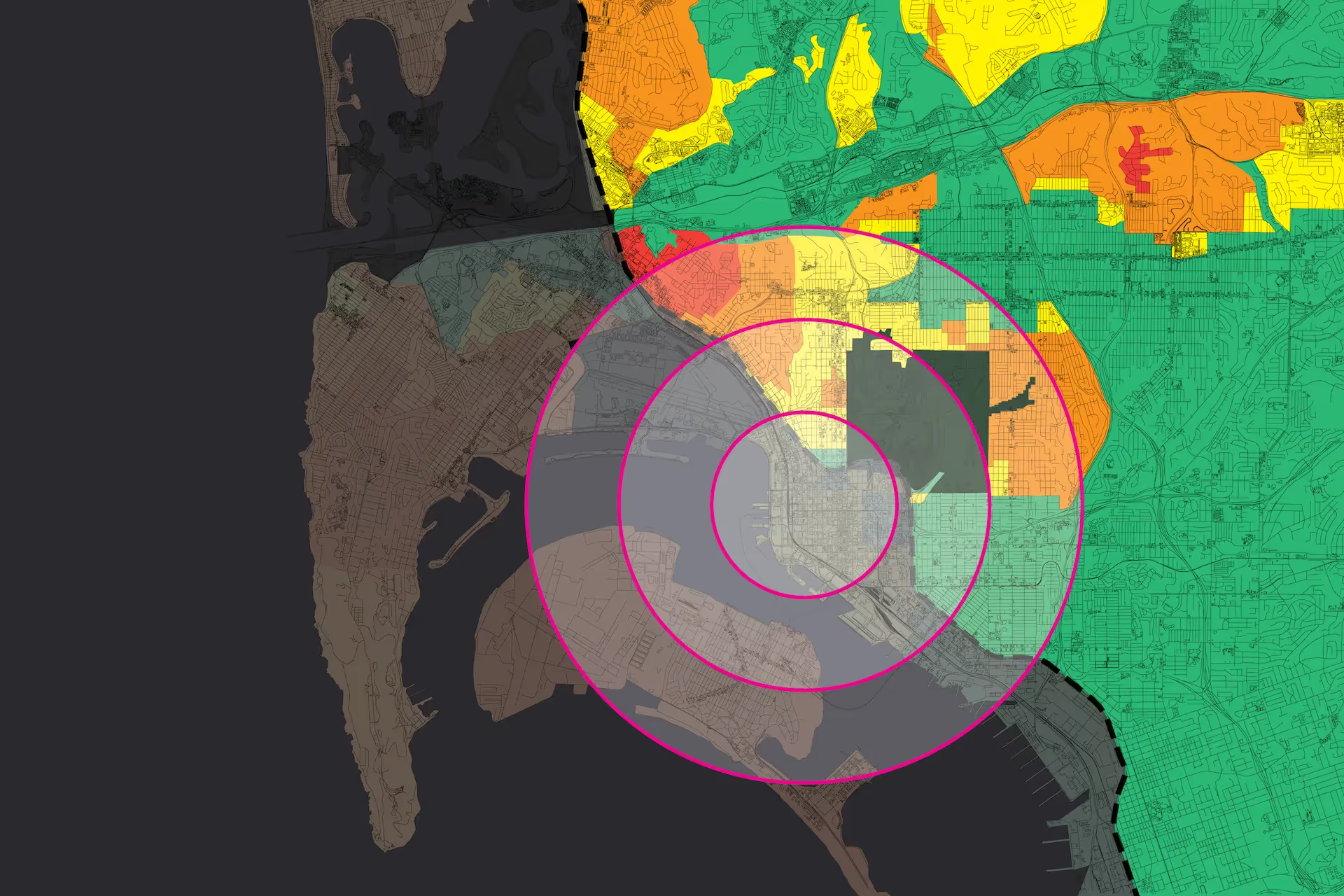
The final component will be updated business cards. These include the redesigned logo + brand message, presented in a modern / minimalist aesthetic. Ten Seventy Architecture will still use the color magenta which has become synonymous w/ our work.

Our previous logo was sometimes mistakenly pronounced ‘Ten-Ten Architecture’ so this was our opportunity to change that. By pulling in the leg of the 7 we were able to differentiate it from a 1. We utilized the golden ratio proportions to represent our commitment to great design.
A bold + simple set of words that the market know what type of architecture firm we are + what type of projects we’re best at.
The final component will be updated business cards. These include the redesigned logo + brand message, presented in a modern / minimalist aesthetic. Ten Seventy Architecture will still use the color magenta which has become synonymous w/ our work.
.avif)
.avif)